RESEARCH
For this project, I was looking to take photographs of interesting textures and typography. I did some research into what makes a good texture photograph and found a very useful article by Photographylife. The article says to look for uniform lines or shapes to create patterns and to experiment more in post-processing than you would with a photograph such as a portrait.
PROCESS
To take the photographs for this project, I went to a multi-story carpark and a nearby park. I focused on looking in directions that I wouldn't normally look when taking pictures (up and down) to find photo opportunities I would normally miss. I also looked for interesting textures which included lines and patterns, as well as unique typography.
For this task, I used a smartphone camera (Oneplus 9 Pro). I was able to put the camera into manual mode to experiment with different settings to achieve different effects. I also made use of the smartphone's macro and wide-angle lenses to get different types of shots.
When taking the photographs, I was able to find a lot of lines and repeating patterns on the floor of the carpark. I tried to keep lines in the photographs at 90 or 45-degree angles for better composition. Since I would be putting the photographs into a grid, I wanted the lines within each picture to make one larger pattern for the entire grid. This would tie the photos within the grid together to make a new texture.
EDITING
To edit the photos, I used the smartphone's built-in editing. This allowed me to adjust contrast, saturation, exposure, shadows and more. I could also use the preset filters. I experimented a lot with the editing as the article suggested, with some photographs changing colour entirely. I also cropped and rotated the photographs for better composition and to straighten lines.
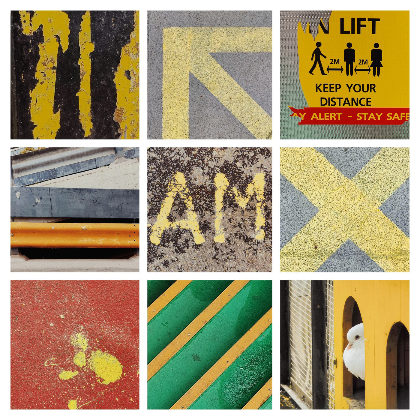
For my first grid, I tried to make colours more vivid. Since there was a lot of yellow in the car park, I gave the grid a yellow theme. Each photo within the grid had a yellow element. I edited the photographs to make the yellow pop more and tried to match the yellows so that it was consistent across the grid.
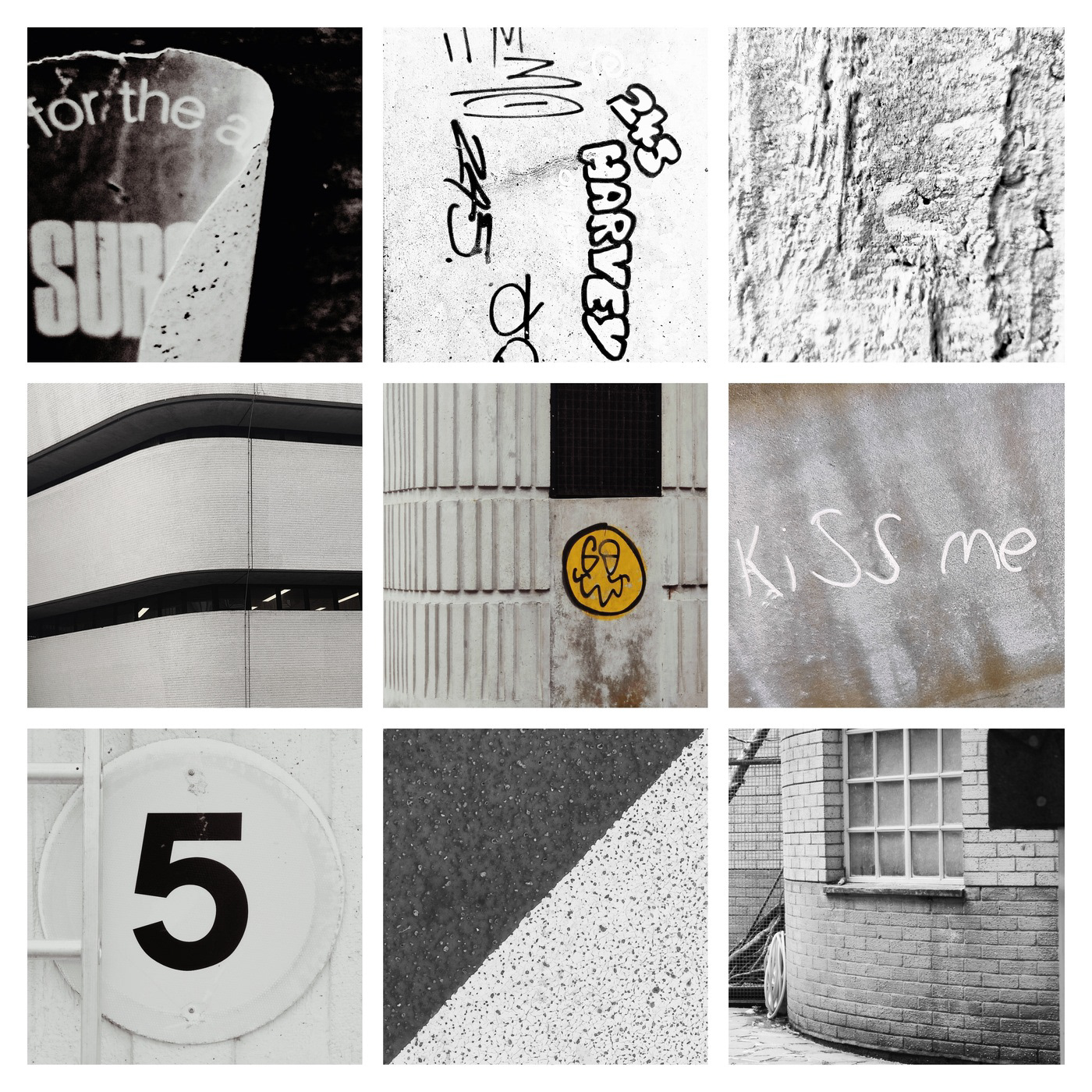
For the second grid, I went in the opposite direction and removed all colour. I edited all of the photographs to be black and white. I liked this, as the absence of colour allowed you to focus more on the textures hidden within the photographs.
Although I liked the black-and-white theme, I felt that the grid needed a focal point to draw attention. One of the pictures I had taken was a white wall with a smiley face graffiti. I moved this photo to the centre of the grid and kept the colour of the smiley face.
OUTCOME


